We are thrilled to finally unveil our new brand identity! The branding was launched last night at our AGM, after an extensive process to develop a new logo for our 36-year-old organisation – a transformation that embodies our commitment to systemic reform and the communities we serve.
Our goal was to modernise our organisation’s branding and include a deeper representation of who we are, all while ensuring we maintain our history, values and core identity. We went through many options and variations before deciding on this new logo with the concept of a kite, which is explained below.
As excited as we are to announce our new look, we have chosen to do things a little differently. Instead of launching our new brand all at once, we are taking a measured and deliberate approach.
Why the slow rollout?
Limited resources, maximum impact: as a small non-for-profit organisation, we face resource constraints that require us to make the most of every dollar and every effort. By rolling out our new brand slowly, we can allocate our limited resources more effectively, ensuring every aspect of the transformation is carried out with precision and purpose.
Ensuring consistency: consistency is key in brand development. A slow rollout allows us to carefully implement our new brand across all touchpoints, ensuring every element is aligned with our purpose, vision, and values. This way, we avoid any rushed mistakes and maintain the high standards our community expects from us.
What to Expect:
Over the next few months, you can anticipate exciting changes at QAI. Along with our new logo, we will have a refreshed website, updated resource materials, and a host of other enhancements that reflect our growth and evolution.
We’re excited to share this transformation with you gradually, ensuring that our limited resources are put to the best possible use and that QAI’s brand evolves with the care and attention it deserves.
Kite concept
The kite is an analogy for QAI and the people we represent. Like wind lifts a kite to fly, QAI creates a force that lifts our community and clients to soar freely without barriers.
Inside the kite, are four segments each with a different colour. These represent the stages of the QAI journey including past, present and future. As you follow the trajectory of each stage, you see it trends upwards and onwards. This is our vision. That we continue our work until we have inclusive communities where all people are equally valued and enjoy human rights and our services are no longer needed.
Colours
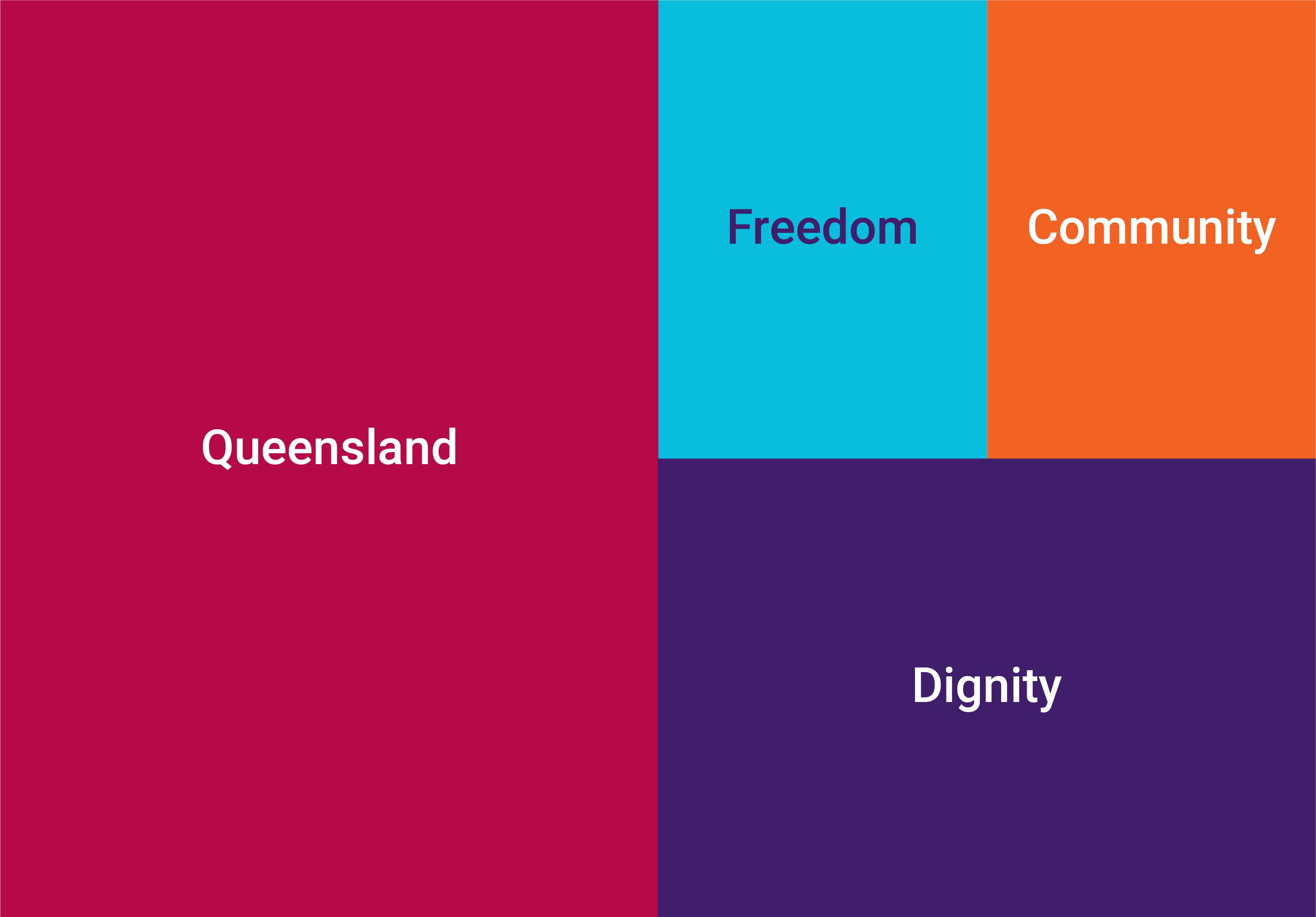
Maroon: represents Queensland, the state where we were founded, and the state we continue to serve. It also pays homage to the bold QAI red that we have been known for from the beginning.
Orange: represents community. The community which has been at our core since our founding, and the community we continue to fight for.
Purple: represents the dignity of people with disability, which we have always fought for, as well as the wisdom, ambition and independence needed to achieve this for all people with disability.
Blue: represents the freedom people with disability will have to live lives free from barriers once we achieve our vision for truly inclusive communities.


